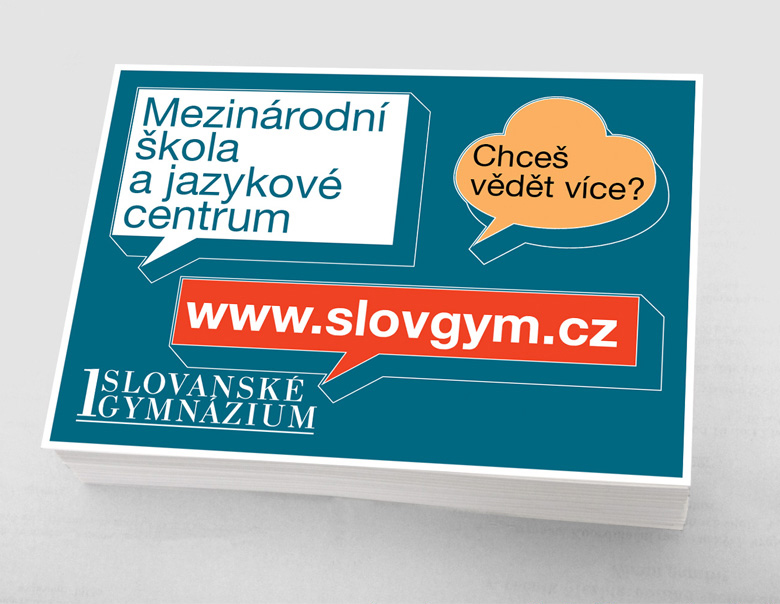

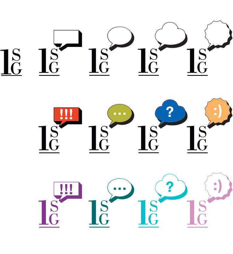
“Dialogue cloud” idea became a part of a game which we realized in the variety of cut logo variants together with “clouds” of different shapes, colors and contents depending on their usage objectives.
This game conception of the logo enriched the corporate identity, made the brand’s image more open complying with the entire strict and restrained idea of the education institution.
This game conception of the logo enriched the corporate identity, made the brand’s image more open complying with the entire strict and restrained idea of the education institution.
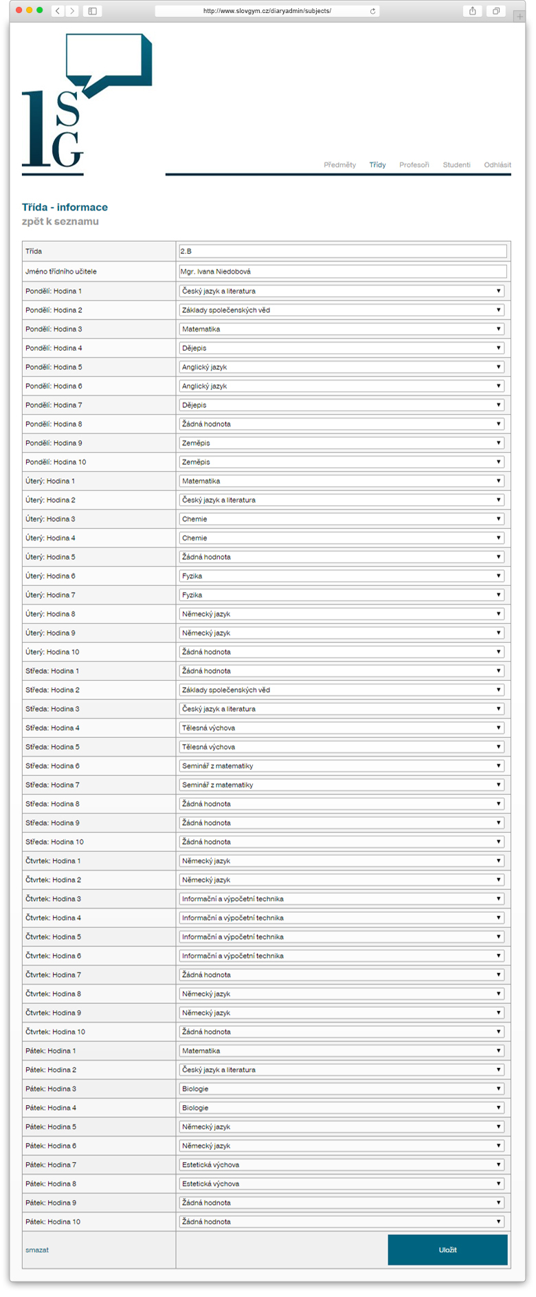


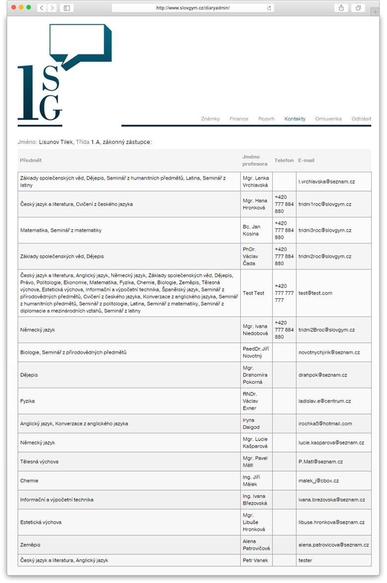


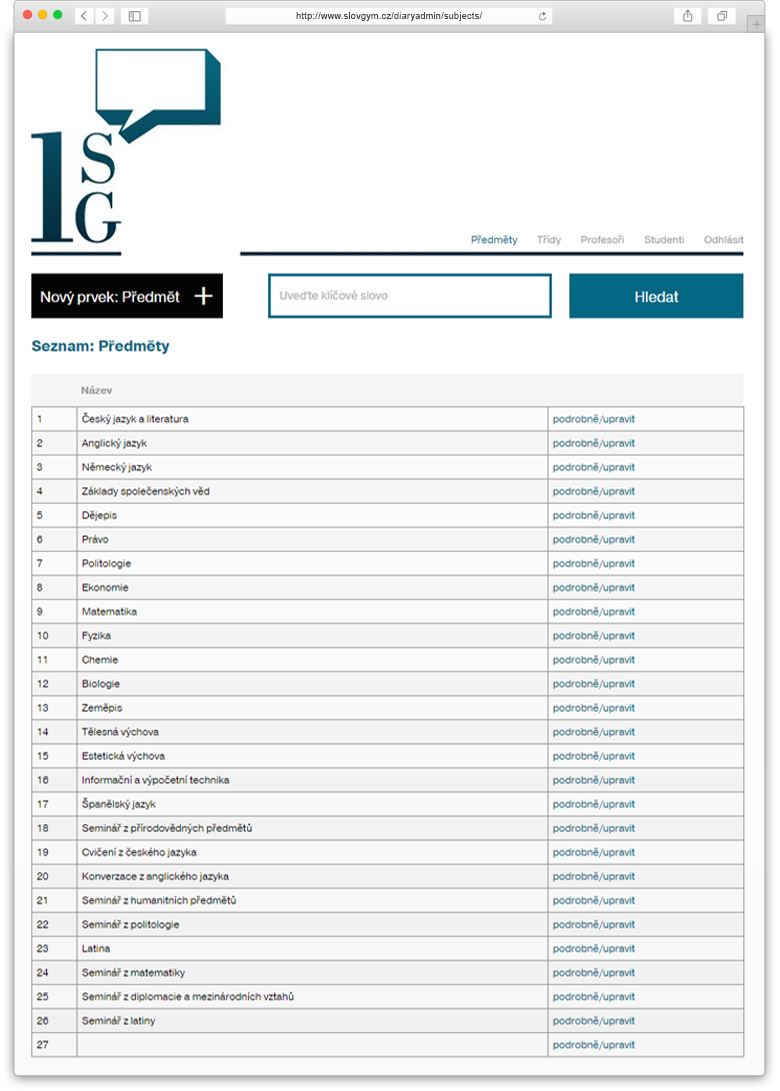

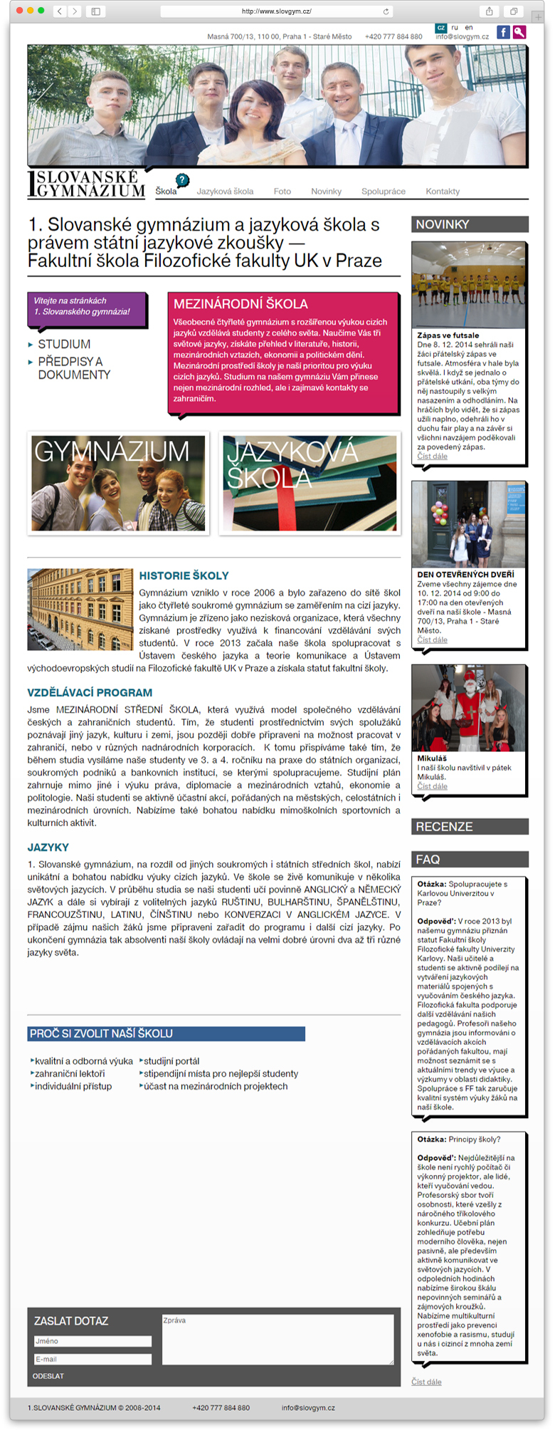
The basis of the website visual shell was formed on a rigor and restraint of lines and shapes and on simplicity and brevity of colors. That represents the identity of the 1 Slovanské gymnasium. In the design of its interface, as in the brand image, we pointed out the concept of the dialogue and openness, which actually plays an important role in the perception of the institution image. The website has a user-friendly option of giving a feedback and an opportunity of a quick application submission.
